8 Critical UX Design Errors That Could Lead to Business Failure
What are the key elements that contribute to the success of an e-commerce business? A broad and varied product range, multiple payment options, responsive and efficient customer service through various platforms, and punctual delivery?
Yes, all these factors are crucial. However, a user-friendly and visually appealing website also plays a significant role, as it can greatly enhance the user interaction experience.
In this article, we will delve into the concept of user experience (UX) design, highlight 8 UX design blunders that can spell disaster for an e-commerce venture, and propose measures to sidestep these pitfalls.
First, let’s clarify what UX design is and enumerate the primary advantages it offers to an online business.
Defining UX Design and Its Core Principles
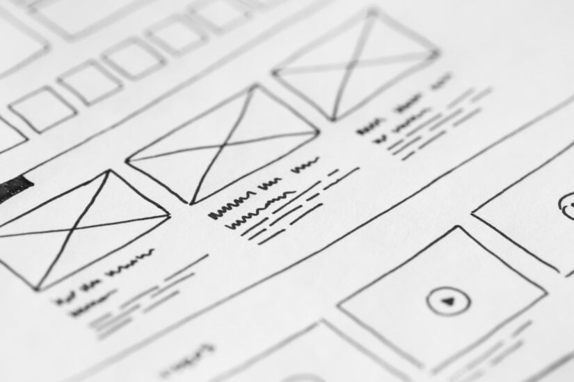
Several definitions of UX design exist, but essentially, it encompasses all aspects of interaction with software, whether a website or a desktop/mobile application. This includes everything from the number of clicks required to reach a specific page to the placement and size of a button within the browser window, all of which constitute elements of user experience design.
Typically, users tend to rate a software product more favorably if it is…
…easy to navigate
…visually engaging
…useful to them
The objective of a UX professional should be to design an app or website that fulfills these fundamental criteria. In essence, the ultimate aim of a UX designer is to boost user satisfaction by making the software product more functional, accessible, and appealing.
To accomplish this objective, UX designers should adhere to the following fundamental principles:
- Be human-centric. Software should be designed keeping humans in mind, not machines. All interactions with an app or website should be meaningful to humans. Reserve computer language for computers.
- Be straightforward. This entails maintaining consistency in the design of website components and establishing a visual hierarchy to distinguish between more critical and less critical elements.
- Be contextual. Users should always be aware of their location on a page or the overall site. Breadcrumb navigation is one way to provide this context.
- Be discoverable. If a website’s content is not logically organized into categories, sections, or other units, users will struggle to find the information they need. This can discourage users from searching for anything on the site. It’s akin to a library where books are not arranged alphabetically.
- Be uncluttered. The design should avoid any distractions that divert a user’s attention from your primary action. This includes distracting fonts and colors, moving images, additional CTAs with high contrast colors, and other elements. You should also use simple vocabulary and avoid technical jargon.
Violate any of these rules, and you’re courting danger. Adhere to them, and you boost your chances of success. Here’s why.
How Does a Strong UX Design Benefit an Online Enterprise?

It Boosts the Conversion Rate
The online retail sector is exceedingly competitive. Imagine you’re hunting for a specific pair of shoes online, and you stumble upon two local websites that sell footwear. On the first site, you search for your desired model but end up feeling frustrated due to its disorganized layout and irrelevant search results. However, the second website delivers the exact match instantly.
Which of these platforms would you prefer to make a purchase from? The answer is clear, and it’s likely that other visitors would make the same decision.
It Leads to Better SEO Rankings
Google frequently updates its search algorithm. However, one consistent factor it values is the user experience. Google prioritizes its reputation, so it rewards websites with superior UX design by placing them higher on the search result pages.
It Draws in More Leads and Retains Current Customers
A user-friendly website doesn’t only attract new users. Seamless interaction also plays a key role in maintaining an existing customer base. A robust UX design fosters trust in a brand, product, or service. It’s an extremely efficient method for building long-term customer relationships. A loyal customer is a steady revenue stream.
Thus, if you want these benefits for your online business, you need to focus on your store’s UX design. Start by avoiding these common errors that contradict the principles discussed above.
Potential UX Design Errors That Can Harm Your Business
- Overly Lengthy Forms
A form can be an effective tool for gathering crucial customer information. However, not all forms are equally beneficial. The type of information you need from a customer depends on why they need to complete a form. If you’re shipping a product to a customer’s address, you’ll need detailed data to avoid delivery mistakes.
Conversely, if you’re offering an e-book download, why include a field for a physical address? Keep in mind: the more fields a user needs to complete, the more likely they are to abandon your website.
What you can do
- Think about different scenarios where you’d want visitors to fill out forms. Evaluate each form and retain only the most pertinent fields for each situation.
- Ensure your form fields are orderly and systematic. This can be accomplished by categorizing them or arranging them in a sequential list.
- Simplify the process of filling out some fields by implementing the autocomplete feature. This feature presents a list of options beneath an input field (like the Google search field), enabling users to select an option instead of typing the full word or phrase. Incorporating a date picker and dropdown menus can also be beneficial.
In conclusion, use any strategy that minimizes the time users spend completing a form.
- Excessive Textual Content
An online store’s primary function isn’t reading, correct? It’s designed to sell products or services. Overloading your site with textual content may deter visitors, who typically aren’t keen on reading lengthy paragraphs.
What you can do
- Reduce the volume of text on your website. Evaluate all your content and retain only what is absolutely essential.
- Opt for bullet points or numbered lists instead of long passages.
- Refrain from extending your text across the entire content area of the page. Ideally, a line of text should contain no more than 60 characters.
- Divide your text into shorter paragraphs. Research indicates that people can remember between 5 and 9 items in their short-term memory. Any more, and they become easily distracted and lose concentration on what they’re reading. Thus, limit your paragraphs to a maximum of 9 lines.
- Substitute text with visuals where possible. Visuals can be more compelling than textual descriptions, prompting customers to make purchases. Most individuals are visually oriented.
- In addition to photos, consider using infographics, videos, cartoons, and other visual elements. However, be sure to optimize these visuals for web use, as high-resolution graphics can significantly slow down page load speeds.
- The Overwhelming Deluge of Popups
Invitations to join, discounts, subscription requests – these pop ups can be irritating when they obstruct the content you’re trying to access. They are a major contributor to high bounce rates.
What you can do
- Steer clear of bombarding your audience with excessive popups. Instead, designate a spot on the page where they can appear without disrupting your visitors’ browsing.
- Give your viewers some time to engage with the content before presenting them with a popup.
- Overcrowded Content with Insufficient Whitespace
Packing too much content into a single page without adequate whitespace around elements is not advisable. It makes it difficult for visitors to discern which elements deserve their attention first, potentially causing them to overlook key business components like call-to-action buttons.
What you can do
Ensure there’s ample whitespace around elements to allow your audience to focus on the most crucial aspects and prevent your pages from appearing cluttered.
- Inadequate Contrast
Low contrast between text and background is a UX faux pas. While it may work artistically in certain contexts, clear contrast is essential for product pages. This is especially true for online stores targeting seniors who may have vision issues.
What you can do
Play around with various contrast settings to find the most suitable one. Share your pages with friends and colleagues and ask for their comfort level while reading the content. Numerous online tools can assist you in determining the ideal contrast.
- Overwhelming Navigation Layers
Providing your potential or existing customers with abundant choices is a good business strategy, but it can negatively impact the user experience. An overload of menus and submenus can deter even the most patient visitors.
What you can do
Ensure that your target audience can access your most valuable offers with just a few clicks. Everything that’s not primary or necessary should be located in its own distinct area on your website. Allow your visitors to easily access the things they would benefit from the most.
- Overuse of Fonts and Colors

One of the key principles of UX design is simplicity. A surplus of colors and fonts can make a website confusing and divert the audience from the crucial actions you want them to perform.
What you can do
- Restrict your color palette to two or three harmonious colors. You can use this tool to help find the best color combinations.
- Also, stick to a maximum of two fonts consistently across your site.
- An Unnoticeable CTA Button
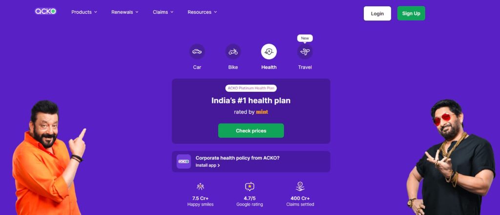
Arguably, the most vital element for an e-commerce website is the call-to-action button. It’s the gateway to your company’s revenue once your customers click it. However, some websites have a CTA button that’s barely visible, overshadowed by the surrounding elements.
What you can do
- Ensure your CTA button stands out by selecting a unique color, style, and text that sets it apart from other elements on the page. Check out the screenshot above for an example of applying the contrast for a CTA button the right way.
- The location of this button is also crucial. Check out this post for some valuable insights regarding the placement of a CTA button: https://www.zoho.com/academy/website-building/cta-buttons/best-practices-for-cta-placement.html
Conclusion
For any digital enterprise aiming for victory, prioritizing excellent UX design is crucial. This could enhance conversion rates, boost SEO rankings, and build enduring bonds with current customers.
As you create your website, strive to dodge the traps we’ve highlighted in this article. Though they only scratch the surface, by sidestepping them, you can make your website more user-friendly and attract new clientele.